4 Free SEO Report Templates That Connect to Live Data
- What a useful SEO report actually needs to answer
- 1. Google Analytics 4 report template for Google Sheets
- 2. Google Business Profile performance report for Google Sheets
- 3. Google Business Profile overview dashboard for Data Studio
- 4. Bing Webmaster Tools overview report for Data Studio
- Getting one connected
- Pick one and run this month's report with it
The worst part of an SEO report isn't writing it. It's rebuilding it.
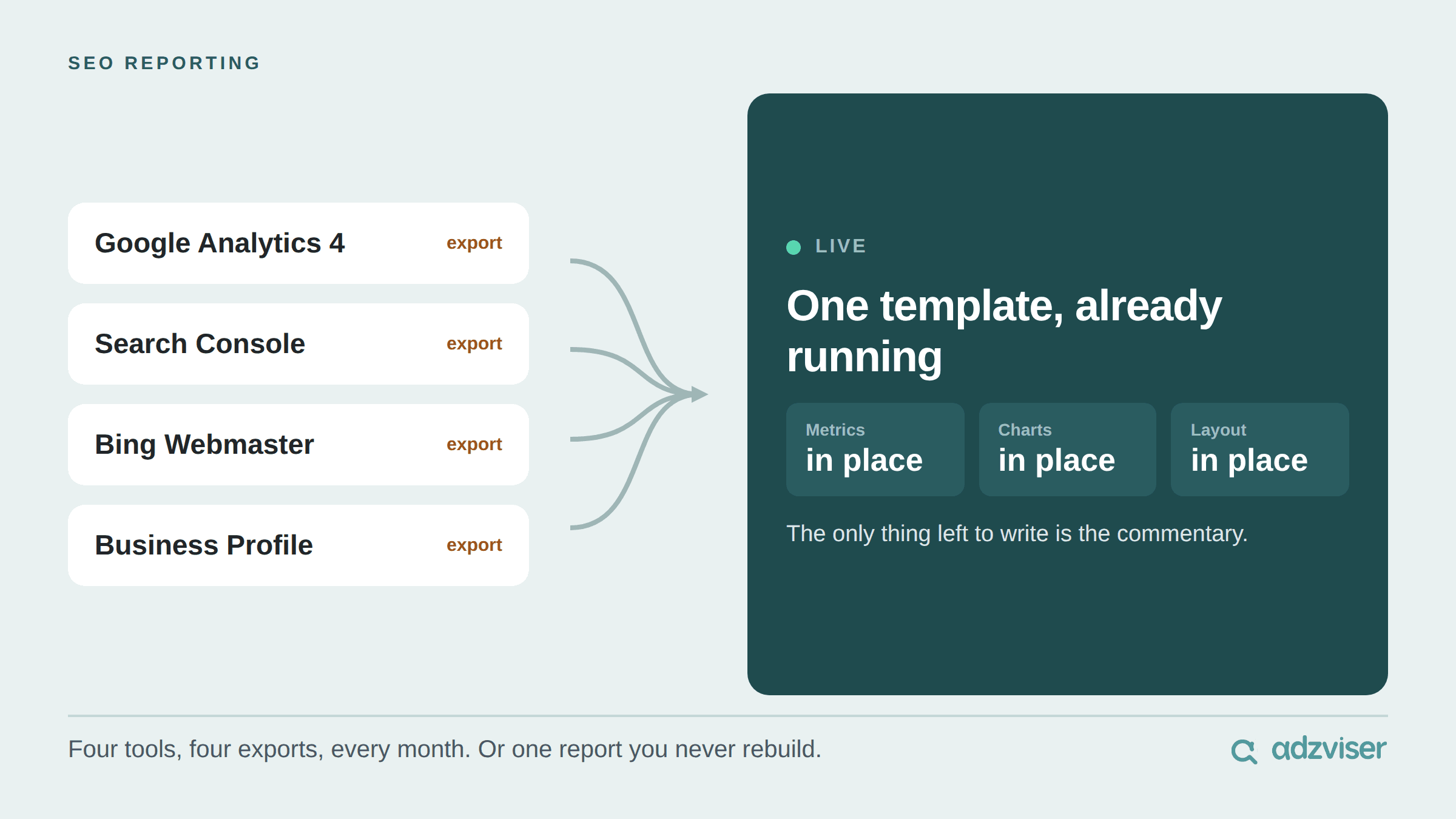
You did this same report last month. Same tools, same exports, same charts, same layout, same order. The only thing that actually changed is the numbers, and yet here you are starting from an empty file again.
It happens because SEO data never sits in one place. Organic sessions are in GA4. Queries and positions are in Search Console and Bing Webmaster Tools. Calls, direction requests and reviews are in Google Business Profile. Four tools, four exports, four sets of formatting, every thirty days, forever.
The fastest way out of that loop is to stop treating the report as something you assemble and start treating it as something that is already running. A template with the metrics, charts and layout in place, wired to your accounts, turns a two-hour build into a ten-minute read. The work shifts from formatting to commentary, which is the only part a client was ever paying for.

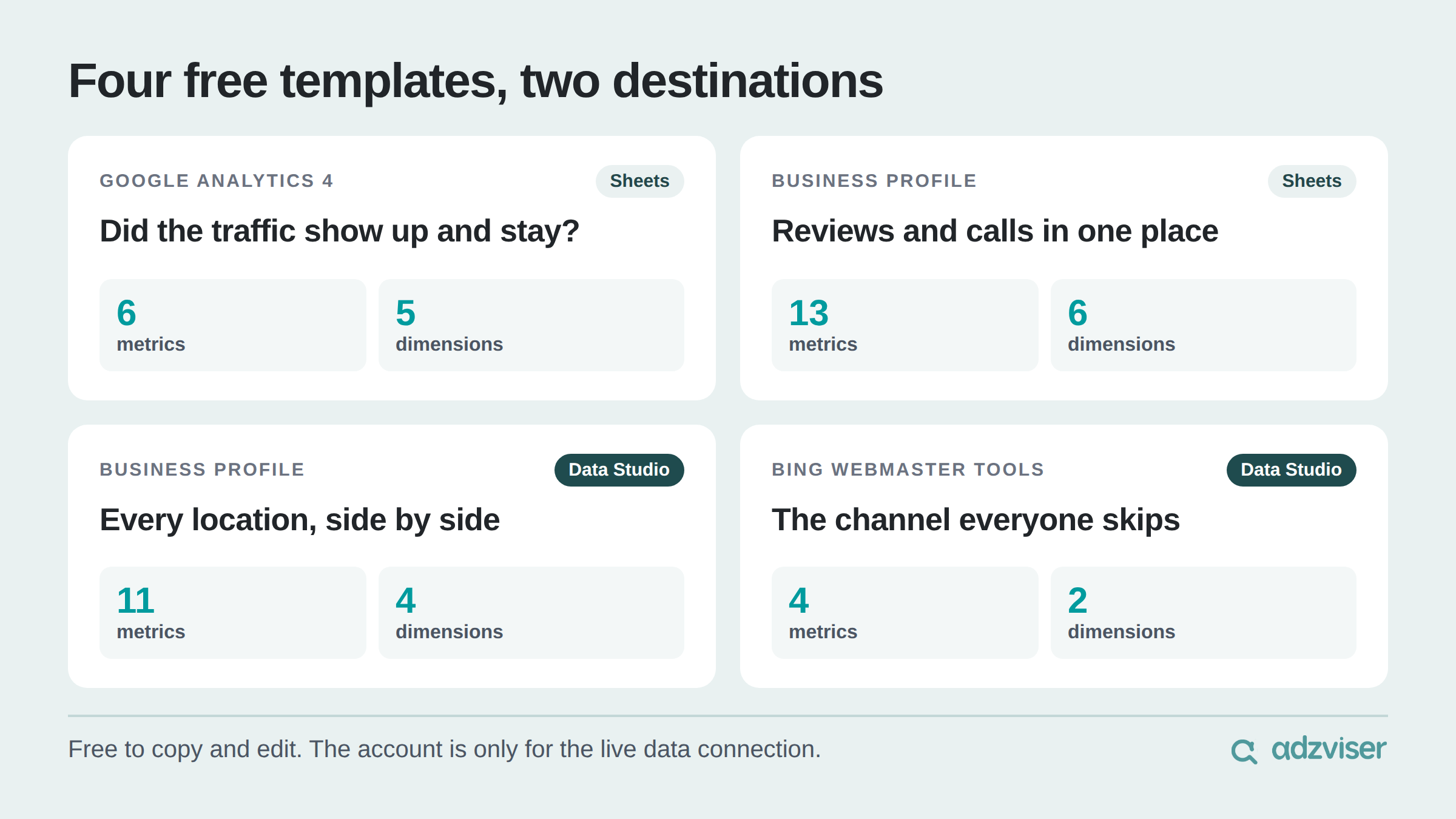
Below are four free SEO report templates from the Adzviser template library. Two are Google Sheets, two are Data Studio. All of them are free to copy and edit, and all of them pull live data once your accounts are connected.
What a useful SEO report actually needs to answer
Before the templates, a quick filter. A report earns its place if a client or a stakeholder can read it and come away knowing three things:
Is organic performance going up or down, and over what window? One number with no trend line behind it is trivia, not a finding.
Which pages, queries or locations are driving the change? This is the part that turns a report into a work plan.
What did that traffic do once it arrived? Sessions that bounce and calls that connect are not the same result, and an SEO report that stops at sessions leaves the best argument on the table.
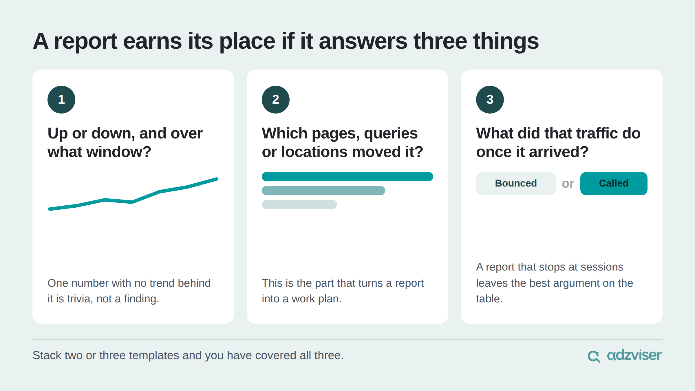
Every template below is built around at least one of those three. Stack two or three of them and you have covered all of it.
1. Google Analytics 4 report template for Google Sheets
Data source: Google Analytics 4 | Destination: Google Sheets
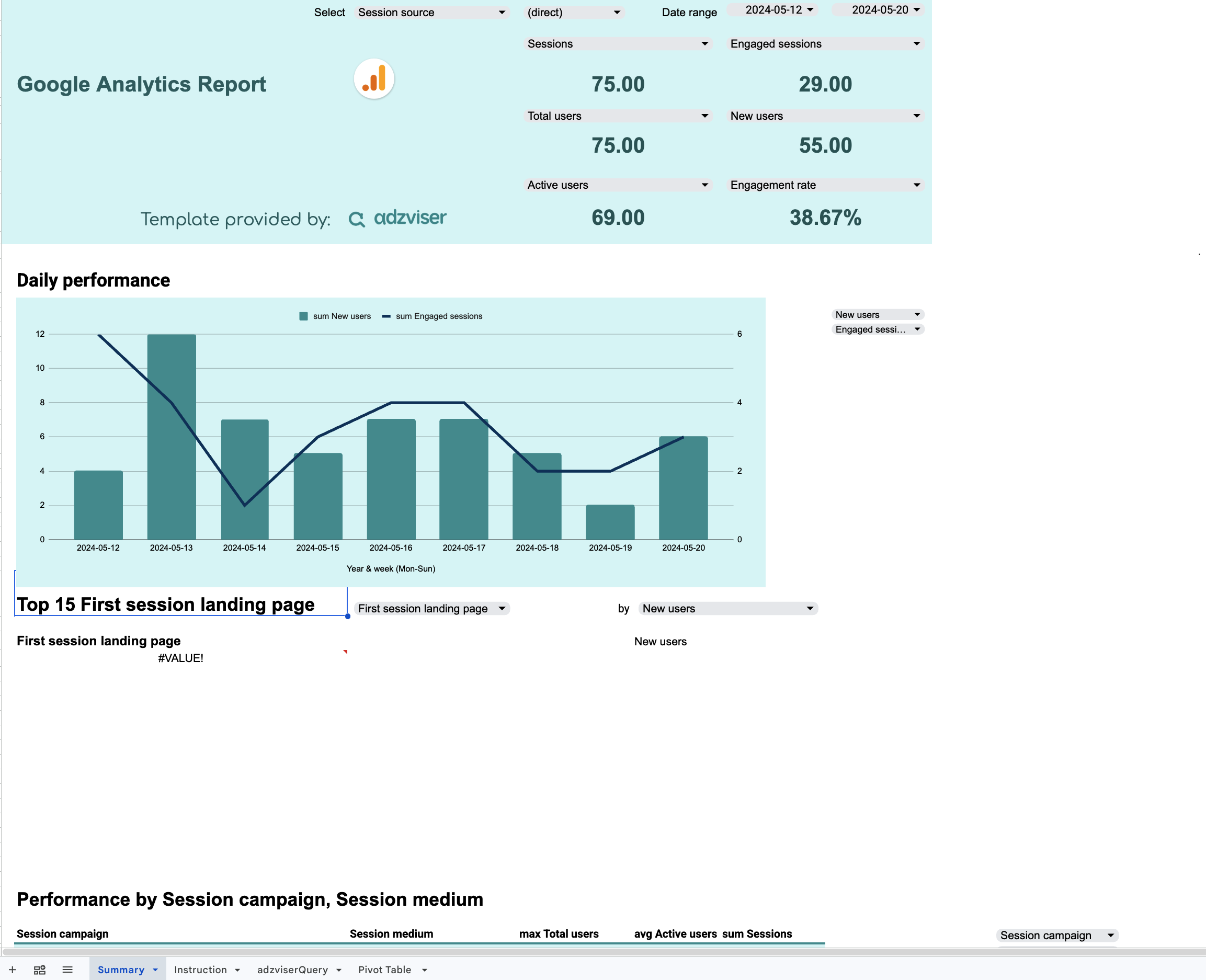
Most SEO reports start here, and for good reason. GA4 is where you find out whether the traffic you worked for actually showed up and stayed.
What's inside:
- 6 metrics: sessions, engaged sessions, total users, new users, active users, engagement rate
- 5 dimensions: date, session source, first session landing page, session campaign, session medium
- Daily trend chart showing the shape of the month, not just the total
- Top-15 landing pages table so you can see which pages are carrying the site
- Breakdown by session campaign and medium to separate organic from everything else
Two things make this one worth starting with. The daily trend is where the interesting question usually hides, because a flat month with a mid-month cliff and a recovery is a very different story from a genuinely flat month. And because it is a spreadsheet, a client request for an extra column or a custom rate is a formula, not a support ticket.
Best for: agency reporting, in-house SEO leads, anyone who prefers to finish the analysis in a spreadsheet.
2. Google Business Profile performance report for Google Sheets
Data source: Google Business Profile | Destination: Google Sheets
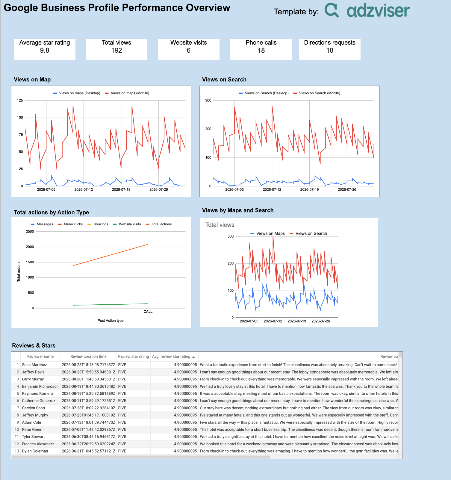
Local SEO has the clearest line between ranking and revenue of anything in the discipline, and this template is built to show it.
What's inside:
- 13 metrics, grouped three ways:
- Reputation: average review star rating
- Visibility: total views, plus views on Maps and views on Search each split desktop and mobile
- Actions: website visits, phone calls, directions requests, messages, bookings, menu clicks, total actions
- 6 dimensions: date, post action type, reviewer name, review creation time, review star rating, review comment
- Trend charts for views on Maps and views on Search
- Action-type breakdown so you can see which action customers actually take
- Reviews table with the full text of each review
The reviews table is quietly the best section in this template. Because it carries reviewer name, date, star rating and the comment itself, the review comments appear in the same report as the performance metrics. When calls dip, the reviews table gives you another place to investigate. A run of lower-rated reviews during the same period can reveal context that a ranking chart alone won't show.
Best for: local SEO specialists, multi-location brands, agencies reporting on service-area businesses.
3. Google Business Profile overview dashboard for Data Studio
Data source: Google Business Profile | Destination: Data Studio
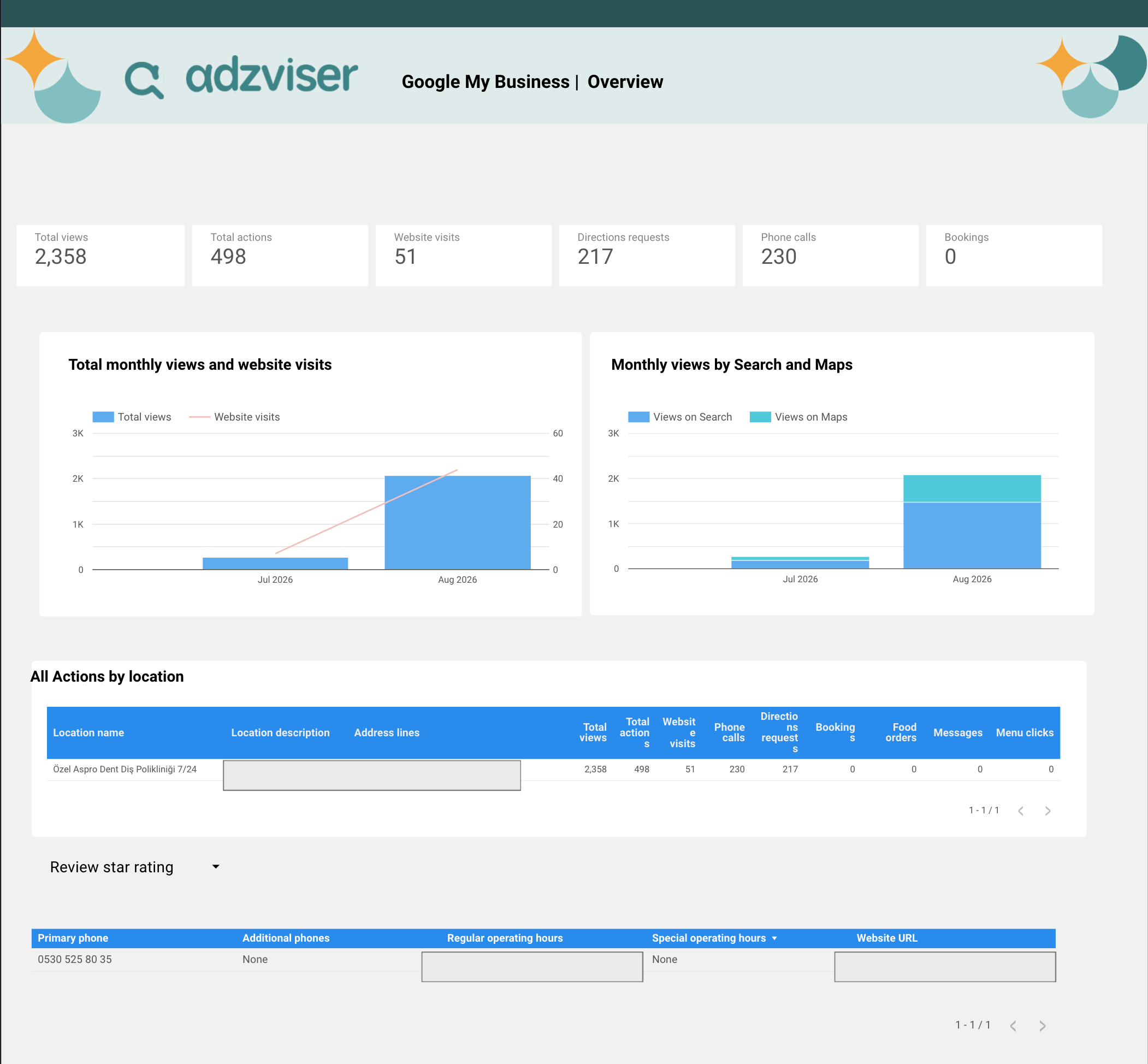
Same data source as the last one, different job. Where the Sheets version is for working, this one is for showing.
What's inside:
- 11 preselected metrics: total views, total actions, website visits, directions requests, phone calls, bookings, views on Search, views on Maps, food orders, messages, menu clicks
- 4 dimensions: date, location name, location description, address lines
- Scorecards across the top for total views, total actions and website visits
- Monthly view trends underneath
- All-actions-by-location table for comparing sites side by side
Food orders, menu clicks and bookings being in the default set means restaurants and service businesses are covered without you configuring anything. But the location table is the real reason to pick this over the spreadsheet: a brand with twelve storefronts gets twelve rows and an immediate answer to the only question a regional manager ever asks, which is how their location compares to the others. Multi-location reporting in a spreadsheet turns into tab sprawl fast. Here it stays on one page, and that page is a link you share once instead of a PDF you email every month.
Best for: multi-location reporting, client-facing dashboards, anyone tired of emailing PDFs.
4. Bing Webmaster Tools overview report for Data Studio
Data source: Bing Webmaster Tools | Destination: Data Studio
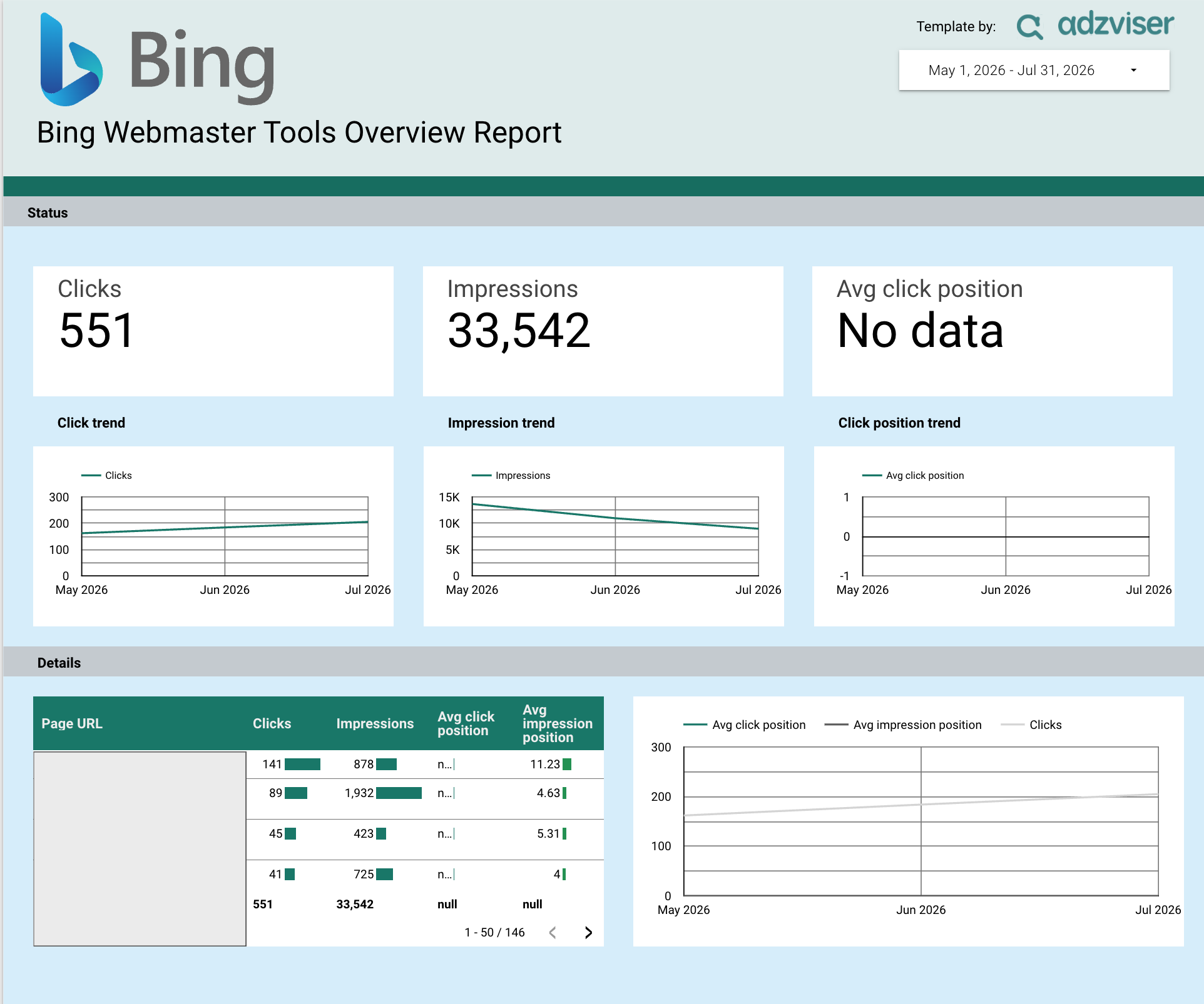
Bing is the channel almost everyone skips in reporting, and skipping it is getting harder to justify now that it feeds answers into other surfaces your audience uses. It is rarely your biggest traffic source. It is frequently your cheapest incremental win, because the pages that rank there are pages you already optimized for somewhere else.
What's inside:
- 4 metrics: clicks, impressions, average click position, average impression position
- 2 dimensions: date and page URL
- Trend charts for clicks, impressions and average click position over time
It is a deliberately small template, and that is fine. This data does not need more than two dimensions to be useful.
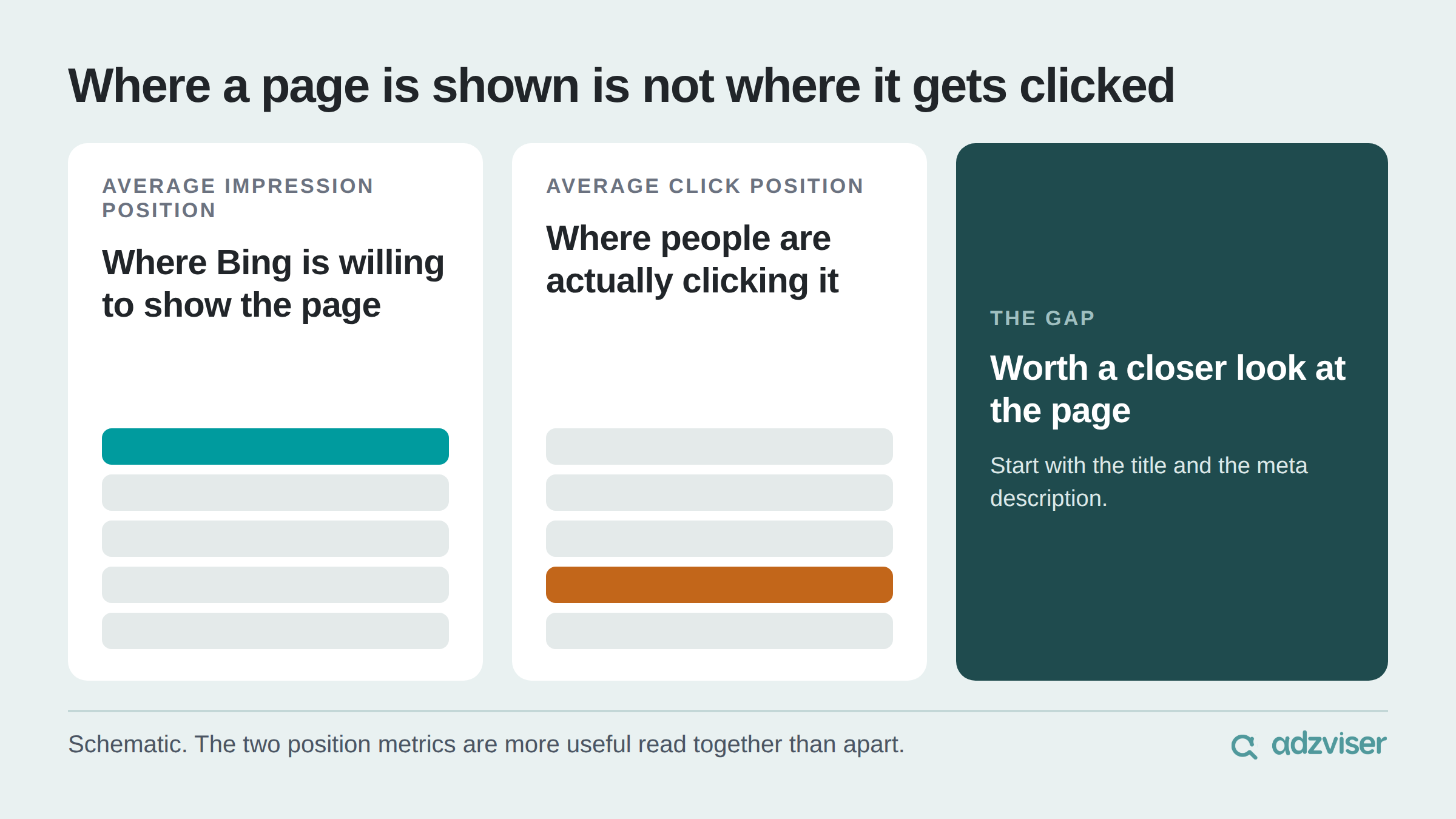
The pairing of the two position metrics is the part worth pointing at in a meeting. Average impression position tells you where Bing is willing to show a page. Average click position tells you where people are actually clicking it. The two position metrics are useful together because they show where a page tends to appear versus where clicks actually happen. A noticeable gap gives you a reason to investigate the page more closely alongside its clicks and impressions.
Best for: SEO specialists running a full-coverage search report, content teams looking for quick title and meta description improvements.
Getting one connected
The setup is the same for every template on the site, and it is short.
- Copy the template. It opens in Google Sheets or Data Studio with sample data in place so you can see the structure before committing.
- Connect your account. Sign up for Adzviser and authenticate the data source you need. The 14-day trial is $0.99, and connections are unlimited, so an agency with forty client accounts is not paying per connection.
- Swap in your data and make it yours. Change the metrics, edit formulas, restyle the charts, add your logo. The data connection survives your edits.
Pick one and run this month's report with it
You do not need a reporting stack. You need one template that answers the questions your client actually asks, connected to live data, that you never have to rebuild.
Browse the full library of 41 report templates across 20 data sources, or start a 14-day trial for $0.99 and connect your first account.
SEO report template FAQs
Yes. Copying and editing any template costs nothing. What requires an Adzviser account is the live data connection that replaces the sample numbers with yours.
Data Studio requests data through the Adzviser data source and may cache results according to its configured freshness setting, so you can trigger a manual refresh whenever you need the latest numbers. Each template page has its own FAQ covering refresh behaviour for that source.
You can. Edits to charts, metrics, formulas and styling leave the underlying data source intact.
Hi! I am Zeyuan Gu. I am building easy-to-use and affordable data connectors for marketers. You can read about my journey and what I have learned along the way on this blog.